[This post is participating in Too Many Projects’ Production Design blog-a-thon.]
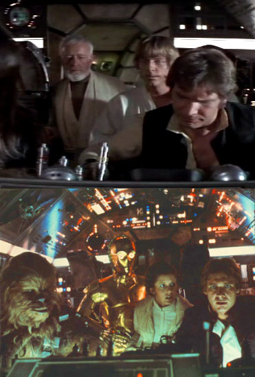
As I’ve written before, there were a lot of things that bothered me about The Empire Strikes Back. But I was only thirteen when I saw it, and a diehard Star Wars fan. It took years even to admit I didn’t like it much, and decades to be able to articulate my complaints. But there was one problem with it that I was able to identify immediately in the summer of 1980: the soft, pinkish light in the cockpit of the Millennium Falcon. It hadn’t looked that way in the original, where the cockpit was shades of grey and fluorescent lighting and harsh shadows.
Had Han Solo had an interior decorator revamp his ship between the two films?
I wondered why the new lighting scheme bothered me so much. It could have been simply that change is painful — after all, the Millennium Falcon was already the coolest spaceship in sci-fi history, and you don’t mess with success. But I felt there must be a more substantive reason, and as I searched for it, I slowly awoke to the importance of production design, and specifically the cleverness of the color palette in the original Star Wars.
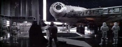
In that film, space is black, sprinkled with white stars. Spaceships are off-white and gunmetal grey. Stormtroopers, Luke Skywalker, and Princess Leia wear white. Darth Vader wears black. The surface and buildings of Tatooine are shades of beige, bleached by the sun. Inside the Death Star: grey walls and floors, grey-uniformed officers, black prison cells.
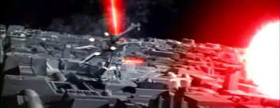
Everything is stark. There is almost no color in Star Wars — except when lasers are firing, lightsabers are clashing, and spaceships are exploding. Then what might have been only a modestly exciting action sequence is amplified, by contrast with the rest of the film’s chromatic drabness, into literally a dazzling thrill.
In 1939, when The Wizard of Oz shifted abruptly from dreary greys into Technicolor, audiences were exhilarated. Ingeniously, the art directors of Star Wars took that one tremendous sensation, chopped it up into small doses, and meted it out to their audience in electrifying little jolts throughout the entire movie — a strategy that the designers of Empire, with its more liberal and therefore less effective use of color, unwisely chose to forgo.
I wouldn’t, off the top of my head, have thought of the aesthetic of Star Wars and Empire as being that different, but upon reflection I think you’ve put your finger on something key. A very nice post!
Just came across this, but there is another reason for the lack of color in parts of SW.
A number of the spaceship models were more blue in color, but in order to minimize the prominence of matte lines, they threw away part of the blue color record, which made the lines black rather than blue. That also took the blue out of the ships, making them more white-grey. They did it different in EMPIRE, which is why some of the ships are blue (and look worse IMO) …
Also, the cinematographer on SW ignored a lot of GL’s ideas and did it his own way (better than Lucas’ ideas IMO, since GL seemed to want the thing to look like LUCKY LADY or MURDER ON THE ORIENT EXPRESS, which would have been horrible for this movie.)